October 3rd 2023
How My Style Developed
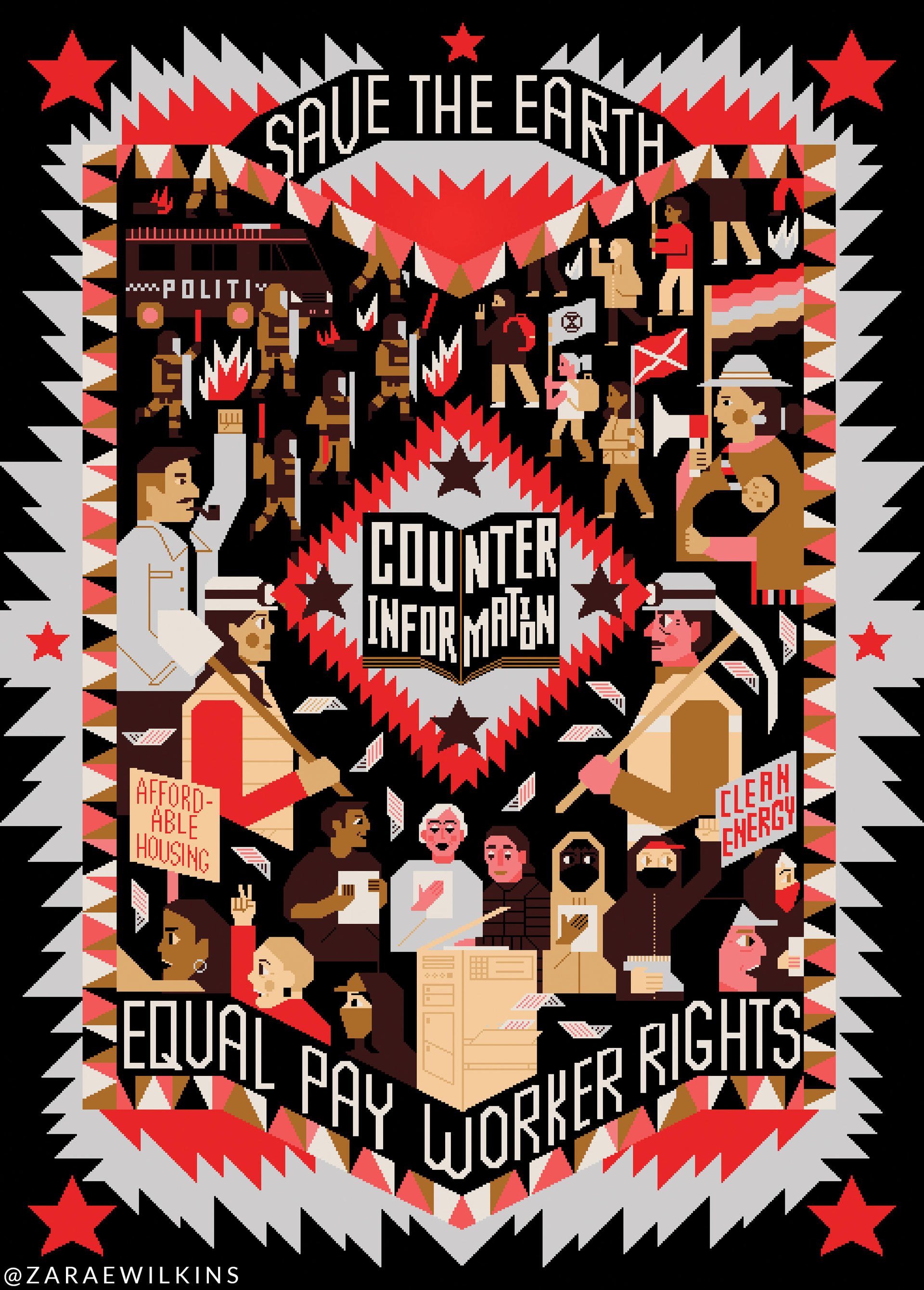
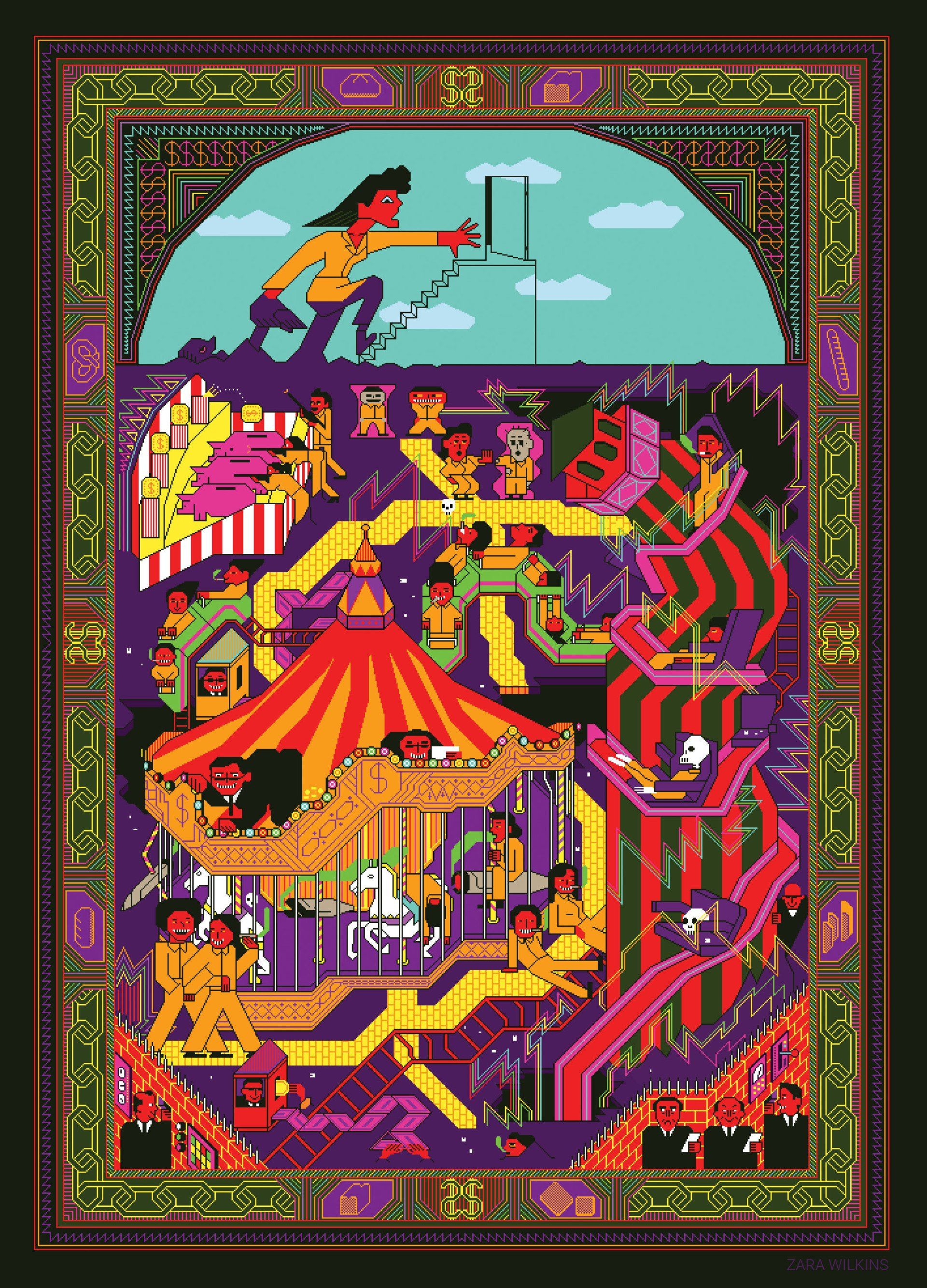
I wanted to start by showing where I want my illustration work to go, below are the three illustrations I have made that I like the most and will reference back to when I am feeling a bit lost with how to create a new one! I have tried lots of different variations of this same style. I think the biggest thing that I have decided on was that I wasn't going to outline things anymore. Further down I'll go through things that I have picked up and dropped along the way! But here is how I want things to look from now on when illustrating in this style.


The first time I used pixels as a form of illustration
In the 2nd year of uni which was in 2018 (before I went on exchange to Rotterdam) we were doing an abstract project and I kind of ended up doing the opposite of what we were meant to do, but hopefully it makes sense when I explain it. In the project we had to choose a poem, a story or a news article about something and illustrate it in an abstract way. This was the time of the Syrian War and one of the options was to illustrate about a BBC news article about the war. I was trying to think about how to illustrate it and I started looking into middle eastern art and came across Afghan War Rugs (some examples below) which come from this website


I can't remember exactly how I got to thinking of it, but I was imagining different ways that I could use this as inspiration and then I suddenly thought of using pixels. Rugs and tapestries are kind of made up of lots of rows and columns of knots, and thats kinda what pixel art is - so it should translate ok? And it turns out that it translated pretty well. The thing that I really loved about the rugs was how they were using traditional techniques and symbolism to tell the story about the afghan war. I ended up spending hours reading about the rugs & looking into islamic symbolism in the patterns and colours used. Its super super fascinating I'd really recommend reading the wiki page on afghan war rugs.
So with this project, these are the images that I came up with. In them I directly copied symbols and pictures that I had seen from the rugs and put them straight into my illustrations in pixel form to tell the story of the Syrian War as described in the BBC news article. The reason I thought it worked for the abstract project was because I thought all of the deeper meaning behind the symbolism would fit into the realm of abstract, but as you can see, and in hindsight the illustrations are very pictorial and literal and include text.
After that project was over it was near January which was when I moved to the Netherlands to study at WDKA in Rotterdam. I knew I wanted to continue with this style, but maybe create my own way with it and it not necessarily be attached to it being a rug or being tied to Islam specifically as I would be illustrating for projects that were unrelated to that. During that time we did lots of different projects where I worked in other styles too, but I did make one illustration about surveillance in the Netherlands which was a brief by Amnesty NL. I knew that this style was quite striking so thought it would be a good one to catch peoples eye. The other time I used it was in 3rd year for a project about climate change. My final year show was a bit rushed because of various reasons!! But these are what I came up with. I tried to play around with some illustrations being more rug like with the border, and some without the border.


My first commissions
I finished studying in 2019 and I think it was within the first year of leaving my tutor
Phil Wrigglesworth who at the time ran Beneficial Shock Magazine asked me to create a 10 page illustration for it. The only other commission i'd done before that was for Beneficial Shock's social media (the first image). At uni he was a big fan of this style and was enthusiastic that I should make it into something. I'm not really sure that I would have got this far without him, or it at least would have taken another 5 years to get to this point.


As I have found with pretty much all of the creative things I have done up until now, unless I'm forced to do it, I will reach an emotional barrier with it and give up. But that's the really great thing about doing commissions is that you have to do it otherwise there will be conflict (which in my early 20s I liked to avoid at all costs!)
Being forced to illustrate was the best thing
This won't work for everyone, but the thing that was the most useful was being forced to illustrate. In a way I was forcing myself because I was emailing people and asking them to give me work. And then when I got the work, I was forced to meet a deadline and not screw up. It genuinely was painful doing it. I actually really really disliked illustrating the first few commissions I had. There were only sprinkles of joy here and there towards the end when it was coming together. The worst thing about it was the composition and the ideas. But I think this is normal. I had no idea what my style was. All I knew it was vaguely inspired by rugs and tapestries, and it was made of pixels. So I kept looking back at Pinterest and the other stuff I had made and eventually I got to this point.
One illustrator I was inspired by in the early days was Joo Hee Yoon because of the way she moved the characters bodies and expressions around. I really wanted to create my own version but in pixels, but it never really worked. But I'm happy with how its turned out. I still think that my illustrations could go a bit wilder and weirder, which I might try and do in the future we shall see!
The illustration I most dislike
Speaking of which, I am reminded of another commission I did which was for Left Cultures (Issue 1) which I feel was a turning point in my style. Mostly because I didn't really like what I had created. Even though on instagram it's one of my most liked posts I don't really like the style at all. The main difference is that everything is outlined with black. Which I feel like for my style it kinda takes away the colour and makes everything dull. Its unnecessary and kinda just gets in the way when I'm making. I tried to make things wonky and weird, which is fine, but maybe a bit distracting? I do quite like the border, but even then I prefer the blocky shaped border of the illustrations that are at the beginning of this post. Maybe this is just how I feel at the moment, and it might just be this particular one. But I just wanted to highlight it because it influenced the illustrations I did after that, because I stopped outlining everything.
Some last bits of inspiration
I wanted to share a few different bits of inspiration. It may or may not be clear how the different images inspired me but hopefully I can explain a bit!
1) Inuit Applique - I like how the characters are really highlighted against the dark background. It makes use of the negative space. This was something I was inspired by for the illustration Left Cultures Issue 2 (the first one at the top of this page). This technique is also present in different persian rugs such as in (2)
2) Rugs all over the world, this is example is of a 'Eastern Caucasus Pictorial Rug' source unknown, found it on Pinterest.
3) Samorost the game by Amnita Design. So I'm starting to see theres something going on in my brain about black backgrounds. And I think it might be related to this game. When I was maybe 5, my uncle showed me this really amazing and weird puzzle game with a little space guy going around different planets trying to find his dog. Its not the art style exactly that I am inspired by (though I do like it) but the atmosphere it puts across. Theres a kind of cute, funny, mysteriousness to it and I always seem to go back to that where I can.
Lastly a list of illustrators that I was inspired by over the last 5 years:
4) Joo Hee Yoon - For her characters, colours and wonkyness
5) Kustaa Saksi - For the composition and making me inspired to make my illustrations physical (which I'm still yet to do)
6) Clive Hicks Jenkins - Black backgrounds again!
7) Eleanor Stonaker - Just a mad artist and just produces so much. Also the wonky characters
8) Jesús Sotés Vicente - Love the composition and the perspective.
One thing that all of these artists have in common is that they play with perspective. They using 2D and 3D and isometric as well as playing with perspective all in the same image which is something that I try to do in my illustrations too to make it more fun and weird.


